Case Study: Indian Canyon Gardens
Rebranding a Mid-Century Community for a New Generation
Role: Freelance Creative Consultant
Focus: Visual identity, brand strategy, community presentation
Tools Used: Digital design, brand mockups, presentation materials
Project Overview
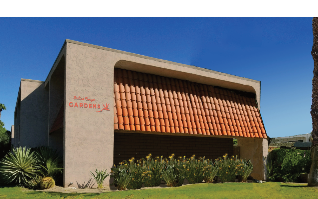
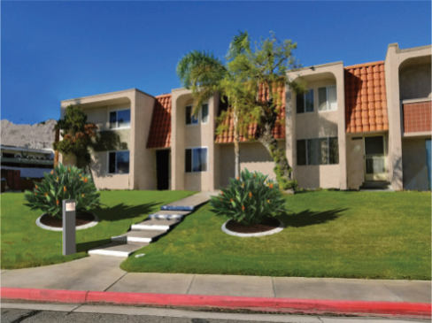
Indian Canyon Gardens is a mid-century residential development in Palm Springs, CA that was facing an identity crisis. With an aging population and a wave of newer, more modern developments rising around it, the community needed a refreshed brand to attract younger homebuyers—without losing the charm that made it special.
I was brought in by the Homeowners Association to reimagine the development’s visual identity and create a vision for future improvements. My goal was to craft a brand that felt elevated and stylish but still grounded in the authentic character of the neighborhood.
What I Set Out to Do
Create a new logo and visual identity that honored the community’s mid-century roots
Develop a color palette that worked with existing architectural constraints
Present a cohesive brand vision that could guide future signage and landscaping
Balance the creative desires of the HOA board with the technical realities of implementation
Use my local knowledge of Palm Springs style and culture to inform the design
The Logo
The original logo was a simple text treatment that had faded into the background of a rapidly modernizing neighborhood. During my site visit, I noticed the landscaping featured many Birds of Paradise—an iconic and sculptural flower that felt like a natural symbol for the community. I used its form as the basis for a new logo that blended mid-century elegance with a fresh, modern sensibility.
To reflect the area's design heritage, I paired a script font reminiscent of the original logo with a clean sans serif, creating a balance between nostalgia and clarity.
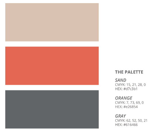
The Palette
Color was one of the biggest challenges. The development’s Spanish tile roofs had aged differently across buildings, and some units featured pale green accents. Replacing the tiles wasn’t an option, so I designed a palette that embraced the desert landscape—warm tones with yellows and oranges that harmonized with the existing materials.
A carefully chosen orange accent helped unify the varying roof shades and gave the brand a cohesive, sun-washed identity that stood out next to the sleek, cooler-toned developments nearby.
The Process
I created digital mockups and brand guidelines, which I presented to the HOA board during their regular meeting. The process involved close collaboration—refining the materials based on feedback, navigating budget constraints, and ensuring the final designs could be implemented by the paint crew without custom color complications.
My role required both creative direction and practical problem-solving, bridging the gap between vision and execution.
What I Gained
This project deepened my appreciation for working within real-world constraints—architectural, financial, and interpersonal. It was a chance to apply my design skills, local knowledge, and presentation experience to a project that directly impacted a community.
Why It Matters
The rebrand gave Indian Canyon Gardens a renewed sense of identity and visibility. Residents responded positively to the updated signage and refreshed landscaping, and the development now stands out with confidence in a competitive housing market. This project shows how thoughtful design can elevate a place without erasing its history.
Digital mockups.
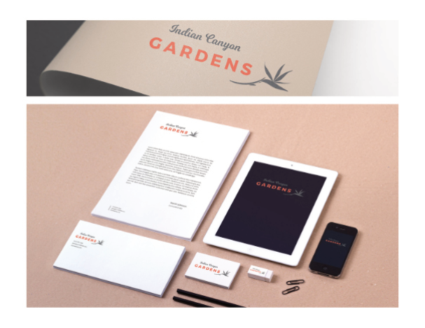
Indian Canyon Gardens brand.