Case Study: wearedrowner.com
Building a Digital Sanctuary for a Post-Punk Persona
Role: Creative Director
Focus: Concept development, visual design, user experience
Tools Used: Squarespace, custom CSS, video editing, stock footage manipulation
Project Overview
Drowner is my post-punk/goth rock artist persona. In a digital landscape dominated by algorithmic feeds and attention-hacking tactics, I wanted to create a space that resisted the norms of music marketing. The result is wearedrowner.com—a slow, immersive, and deliberately non-optimized website that invites users to engage with the project on its own terms.
The site is a series of full-screen, black-and-white video loops styled to look like degraded VHS footage. Each page features a single line of animated green monospace text—lyrics from Drowner songs—typed out as if by an old terminal. Each line is a link to the next page, creating a meditative, nonlinear journey through six unique scenes. The final destination is a fully functional, retro-styled web forum that serves as the project’s only social space.
What I Set Out to Do
Reject the traditional, algorithm-driven model of music marketing
Create a digital experience that mirrors the emotional tone of Drowner’s music
Use retro aesthetics in a modern context to subvert genre clichés
Build a self-contained ecosystem for fans to explore and interact with
Reclaim control over how and where my art is experienced
The Visual Language
The site’s aesthetic draws from the visual vocabulary of analog media and early computing. I manipulated stock footage to create looping scenes that feel haunted and tactile—like memories recorded over too many times. The green-on-black monospace text evokes vintage terminals, reinforcing the sense of digital decay and isolation.
Each lyric is a breadcrumb, leading the user deeper into the world of Drowner. The transitions are slow and deliberate, encouraging reflection rather than rapid consumption.
The Forum
At the end of the lyric journey, users arrive at a fully functional web forum styled like a monochrome CRT interface. This is where all project information lives—releases, updates, and community interaction. It’s my alternative to social media: a space that’s quiet, intentional, and free from algorithmic interference.
Challenges & Philosophy
The biggest challenge wasn’t technical—it was emotional. As an artist, it’s disheartening to see creativity reduced to content, shaped by invisible algorithms and advertiser preferences. I didn’t want to play that game. This project is my way of opting out.
By building a site that demands time and attention, I’m asking fans to meet me halfway. It’s not optimized for clicks or shares—it’s optimized for presence. It’s a small act of resistance, but it’s mine.
Reception & Reflection
As expected, growth has been slow. But the feedback from those who’ve found the site has been overwhelmingly positive. People describe it as “cool,” “refreshing,” and “unlike anything else.” That’s exactly what I hoped for.
This project isn’t about going viral. It’s about building something real, one person at a time.
Why It Matters
The Drowner website is more than a portfolio piece—it’s a manifesto. It shows how digital tools can be used not just to promote art, but to protect it. It’s a reminder that we don’t have to play by the rules of platforms that don’t serve us. We can build our own.

wearedrowner.com website.
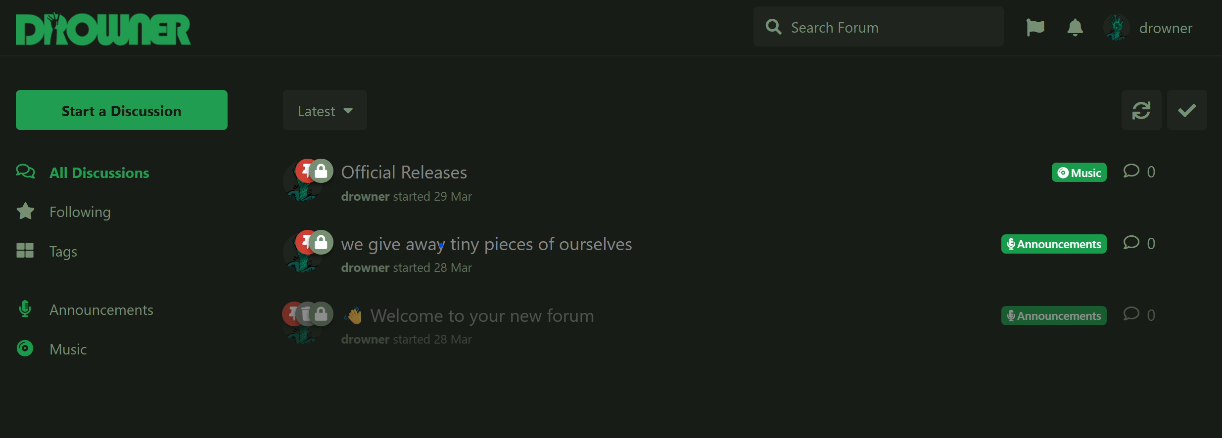
wearedrowner.com forum.