Case Study: ARO Pistachios
Premium Packaging for a Bold, Boutique Food Brand
Role: Freelance Design Consultant
Focus: Brand identity, packaging design, production coordination
Tools Used: Digital design, print production, FDA compliance, cross-cultural research
Project Overview
ARO Pistachios is a boutique brand specializing in the “Aria” variety—renowned for being the largest and most flavorful pistachios on the market. As the company expanded, its original branding—designed on a tight budget—no longer reflected the quality of the product or the ambition of the business.
I was brought on to redesign the brand identity and packaging, creating a more cohesive and upscale visual platform that could stand out in a crowded market while remaining cost-effective to produce.
What I Set Out to Do
Refine the brand’s visual identity while honoring the client’s original “cigars and whiskey” aesthetic
Create packaging that felt bold, distinct, and premium—without alienating food consumers
Design a bag that worked with existing packaging equipment and protected the product
Ensure compliance with FDA food labeling standards
Adapt the design for international markets, particularly China, without requiring a second identity
The Logo
The client wanted to retain the three pistachios in a half-circle from their original logo and maintain the boldness of their first typeface. I simplified the composition and leaned into the classic, pinstriped feel of the original design. The final logo paired an ornate serif for the “ARO” lettering with a narrow sans-serif to evoke strength and clarity—striking a balance between heritage and modernity.
The Packaging
ARO’s original packaging was predominantly black and lacked shelf appeal. The new design needed to stand out while protecting the product—pistachios degrade when exposed to too much light. Most competitors either use fully opaque bags that hide the product or fully transparent ones that compromise freshness.
I introduced a semi-opaque bag with a custom pistachio-shaped window—a solution that allowed consumers to see the size and quality of the nuts without exposing them to damaging light. This subtle innovation set ARO apart on the shelf, signaling both transparency and care.
The color palette was inspired by the product itself: soft greens and whites to evoke freshness, with a bold pink accent referencing the pink salt used in the recipe. The pink also drew attention to the window, creating a visual focal point without requiring costly spot inks or specialty finishes.
The Process
This project required deep interdisciplinary coordination. I worked closely with packaging engineers to iterate on bag dimensions and fill volumes until we found a shape that looked great on the shelf and worked seamlessly with ARO’s existing equipment.
I ensured the artwork met FDA labeling requirements, including a properly formatted Nutrition Facts panel. As ARO prepared to enter the Chinese market, I adapted the design to align with cultural color associations—ensuring the brand could scale internationally without fragmenting its identity. All of this had to be achieved within strict cost-per-unit constraints to keep wholesale pricing competitive.
What I Gained
This project sharpened my ability to balance creative vision with technical, regulatory, and cultural realities. It was a chance to elevate a small business into a premium brand while solving real-world problems through design.
Why It Matters
ARO Pistachios now has a brand identity that reflects the quality of its product—bold, refined, and shelf-ready. The semi-opaque packaging not only protects the product but also communicates transparency and care, setting ARO apart from mass-market competitors. This project shows how thoughtful design can transform perception, solve practical challenges, and unlock new opportunities for growth.
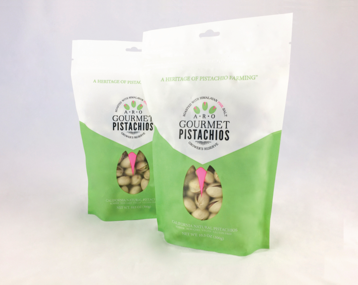
Product image.

Updated ARO Pistachos Logo
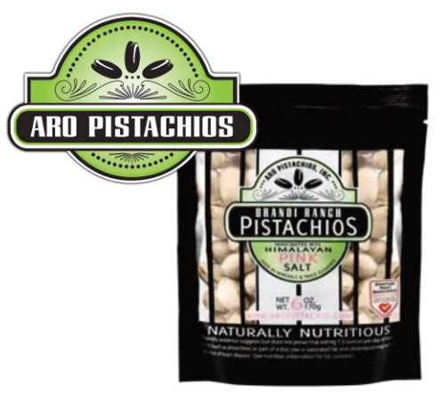
Original packaging and logo.